Mr. Sun has noticed that the new Target in his area flunks the good urban design test -- it's set way back behind a big parking lot.
But I think he's lucky to live near something that's even that well-designed.
Office Depot is building a new store just a few blocks from me. Good news, I thought when I first heard it. Now I can walk to get all that junk I always buy at Office Depot.
I was hoping they'd build something like they did near the historic Dilworth neighborhood in Charlotte, pictured here:
 This is a great corner building: it's built right up to the sidewalk, it has a corner entrance, with windows on all the street elevations; nice use of brick, steel, and glass. The parking is in the rear. It's David Sucher's dream store.
Since the one they're building in Greensboro is also on a corner -- Wendover and Church -- and is also contiguous to two historic neighborhoods -- Fisher Park and Aycock --, I figured they'd do the same thing.
Silly me.
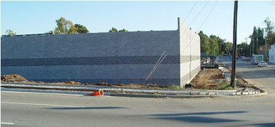
Here's what they're building in Greensboro, as seen from Wendover Avenue:

Yes, you see that right. Office Depot is sticking its rear toward Wendover, in the architectural equivalent of a mooning.
The elevation on Church Street is equally bleak: No openings of any kind (except for a fire door) on either of the main street elevations. Just blank walls of nasty concrete block. It's the New Brutalism sans social ideology: they're just building it that way because it's cheap.
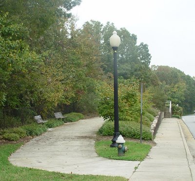
Just a block away, my neighborhood installed an maintains a nice garden area around the Max Thompson Bridge, to help beautify Church street.
What a shame that Office Depot has deposited its architectural ordure so nearby.
And what a shame that Greensboro is not able to attract or compel good architectural design on its major thoroughfares.
Anyhow, I'm not shopping at Office Depot anymore.
9 comments:
I spoke to Bill Ruska and Dick Hails in the city planning department.
As long as the basic setbacks were met, there's nothing in the city ordinance to prevent this ... for now.
But I'm a member of the committee that's rewriting the zoning ordinance, and I'm going to work hard to see this won't be allowed in the future.
David, or is it Super Dave Osborne?
We saw you standing in the middle of Wendover Avenue taking these shots. It was rush hour for heavens sake. Bloggers don't get combat pay do they?
Oh, yes -- we get double our usual pay for jobs like this!
This is what floored me after looking into urbanism models more deeply: the very specific and non-drastic principles that animate the debate. You would be generally happy with an Office Depot which abutted the sidewalk. I bet most people think you frown on all new buildings and fawn over all old ones. What's missing is to blow up the false perceptions surrounding the debate and get people to connect to the truth behind it: the feeling you get when you are walking along a way framed by retail, residential, and commercial structures -- with the color and comraderie of others added into the mix. It's something you have to feel to get.
You don't think there was any profiling involved in the fortress aesthetics?
Not following you, anonymous.
David likes some new construction - the OD in Charlotte is new - just new construction that flows with its surroundings. Maybe local resident input would have helped?
Jim, Sun -- yes, good design trumps mere age for me.
I like old houses because I like some things about the way they relate to their context: generous porches, sidewalks, parking in the rear.
I think old and new can go together.
And I like new stuff that incorporates the successful design features of the old.
That is one of the ugliest things I've seen in a while. I noticed it a few weeks ago and thought it looked like a prison.
Post a Comment